Life Beats is a Digital Medical Service Provider which operates with a chain of doctors and hospitals helping people with access to medical tourism with commission & brokerage free bookings and facilities.
A unique brand identity was essential for this brand but without digital element in the symbol as they wanted to portray life and health which is above all.
Please checkout our approach below:


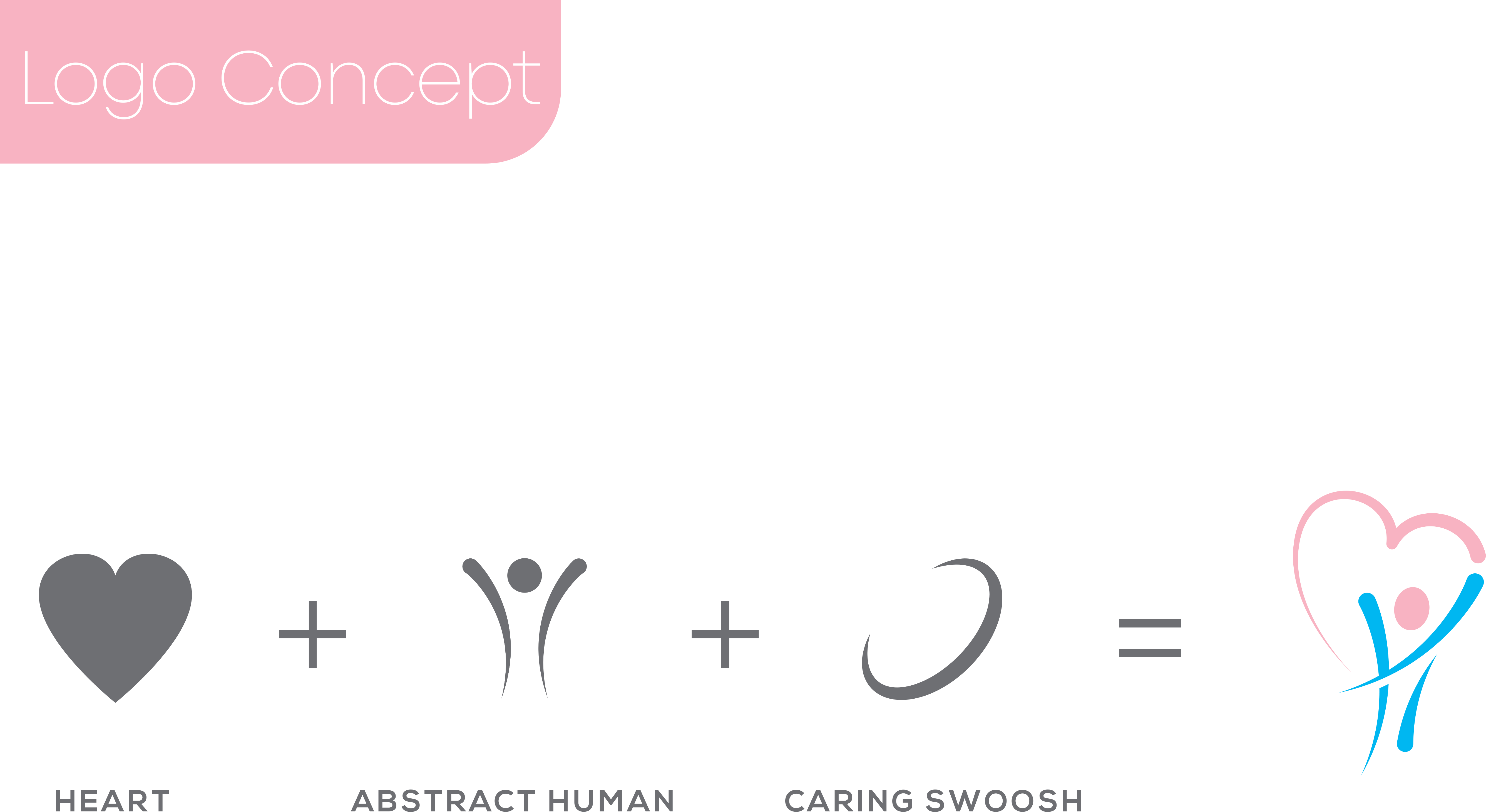
The Concept

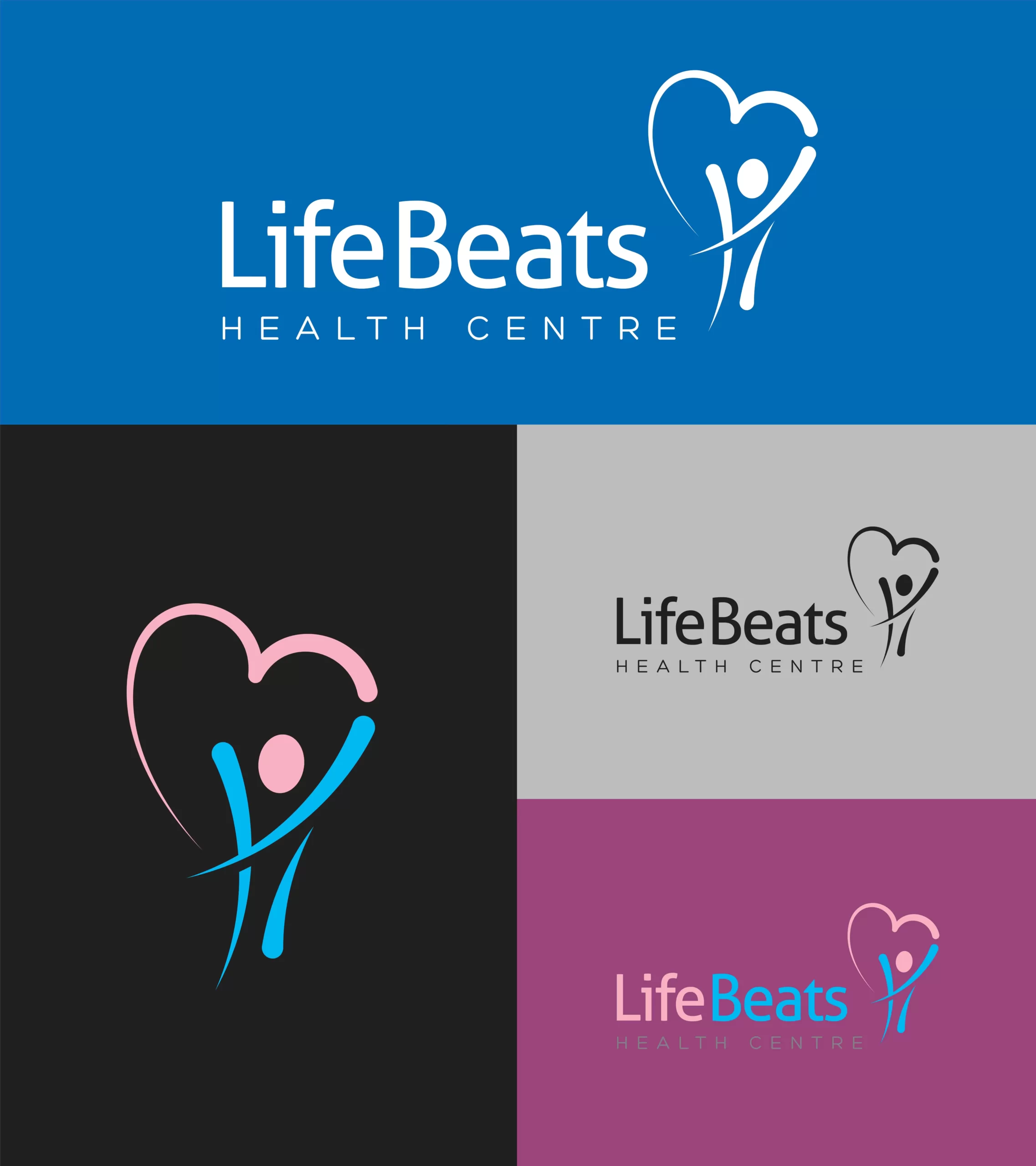
The brand portrays life which the heart symbol justifies, the abstract human figure jumps in bliss with a caring swoosh overlapping around the symbol partially, to exhibit care.

Color Guideline

Three colors have been used here. Since this is a health category Light pink, light blue and gray colors are used. Pink is generally thought as a color that symbolizes sweetness, warmth, love and softness and Light blue exhibits gentle appearance and Grey Color embodies signs of Success,
Authority, Strength And Maturity.


Font Guideline

Modern fonts are very structured and eye-catchy. These fonts have a vertical stress and can be considered determined (sometimes cold) because of no inclination.


Background Guideline

Many times we need logos on different backgrounds, as an example of that is shown here. The color of the logo will change according to the color of the background.
